要件に応じて、FlexChart コントロールのタイプを変更できます。チャートタイプを変更するには、FlexChart コントロールの ChartType プロパティを設定します。この場合、FlexChart に複数の系列を追加すると、そのすべての系列が同じチャートタイプになります。複数の系列を追加し、系列ごとに異なる ChartType を設定する方法については、複合チャート を参照してください。FlexChart は 10 種類以上のチャートタイプをサポートします。
サンプルコード
| C# |
コードのコピー
|
|---|---|
chart.ChartType = ChartType.Area; |
|
折れ線グラフと折れ線シンボルグラフ
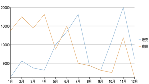
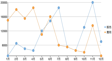
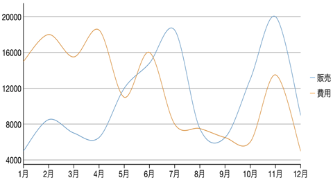
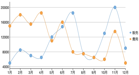
折れ線グラフは、データポイントどうしを線で結んで各系列を描画します。面グラフと似ていますが、データポイントどうしを結んだ線の下の領域は塗りつぶされません。系列は、個別に描画することも、積層にして描画することもできます。これは、さまざまなデータグループ間の値の変化を最も効率よく示す方法です。折れ線シンボルグラフは、折れ線グラフと似ていますが、シンボルを使用してデータポイントを表します。
これらのグラフは、長期にわたるトレンドやパフォーマンスを示す場合によく使用されます。
|
|
|
折れ線グラフ |
|
|
|
折れ線シンボルグラフ |
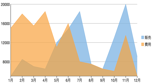
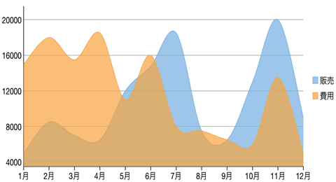
面グラフ
面グラフは、同じ系列のデータポイントどうしを線で結び、この線の下の領域を塗りつぶして量を示します。新しい系列は、それぞれ前の系列の上に表示されます。系列は、個別に描画することも、積層にして描画することもできます。
これらのグラフは、関連する属性間の長期にわたるトレンドを示す場合によく使用されます。
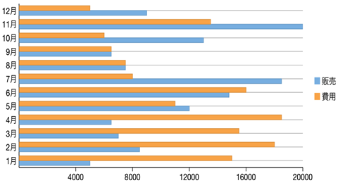
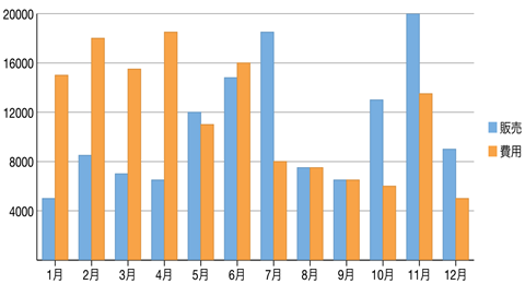
横棒グラフと縦棒グラフ
横棒グラフまたは縦棒グラフは、各系列を同じ色と幅の棒の集合として表し、各棒の長さは値によって決定されます。新しい系列は、それぞれ前の系列の棒の集合の隣に棒の集合としてプロットされます。棒が横向きに置かれる場合は横棒グラフと呼ばれ、棒が縦向きに置かれる場合は縦棒グラフと呼ばれます。横棒グラフおよび縦棒グラフは、グループ化するか、積み上げることができます。
これらのグラフは、年代別や月別などの個別カテゴリにグループ化されたデータを視覚的に表す場合によく使用されます。
|
|
|
棒グラフ |
|
|
|
縦棒グラフ |
バブルチャート
バブルチャートは 3 次元のデータを表します。X 値と Y 値で 2 つのデータ次元を示します。3 つめの次元は、バブルのサイズによって示されます。
これらのチャートは、軸に対する相対位置とサイズに基づいてエンティティを比較する場合に使用されます。

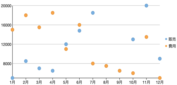
散布図
散布図は、X および Y 軸座標を使用してプロットされた点で系列を表します。X 軸と Y 軸を組み合わせて複数のデータポイントにし、それらを不均一な点の集まりとして表示します。
これらのチャートは、さまざまな X および Y 座標値に対するデータポイント密度のばらつきを判断する場合によく使用されます。
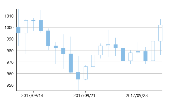
ローソク足チャート
ローソク足チャートは、特定の株の始値、終値、高値、安値を示す株価チャートです。このチャートは、特殊なタイプの HiLoOpenClose チャートで、始値と終値の関係、および高値と安値の関係を示す場合に使用されます。ローソク足チャートは、価格データ(高値、安値、始値、終値)を使用します。また、始値と終値の関係を追加情報として提供するために、太いローソク部分の色とサイズを使用します。たとえば、長い白抜きのローソクは買い圧力を示し、長い塗りつぶされたローソクは売り圧力を示します。
ローソク足チャートの要素
ローソク足チャートは、ローソク、上ヒゲ、および下ヒゲで構成されています。
- ローソク:ローソクの胴体部分(始値と終値の間のバー)は、株価の始値と終値を示しています。
- 上ヒゲと下ヒゲ:ローソクの上下にある細い線(上ヒゲおよび下ヒゲ)は、株価の高値/安値の範囲を表現しています。
- 空洞の本体:空洞のローソクは、株価が上昇したこと(終値が始値より高い)を示しています。白抜きのローソクでは、胴体部分の下端が始値を示し、上端が終値を示します。
- 塗りつぶされた本体:塗りつぶされたローソクは、株価が下降したこと(始値が終値より高い)ことを示しています。塗りつぶされたローソクでは、胴体部分の上端が始値を示し、下端が終値を示します。
ローソク足では、系列内のデータポイントごとに 5 つの値があります。
- x:X 軸に沿ってデータの位置を決定します。
- high:その日の最高値を決定し、Y 軸に沿ってローソクの上端としてプロットします。
- low:その日の最低値を決定し、Y 軸に沿ってローソクの下端としてプロットします。
- open:その日の始値を決定します。
- close:その日の終値を決定します。
次の図は、株価を表示するローソク足チャートを示しています。
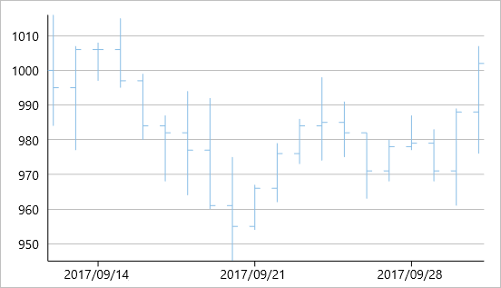
HiLoOpenClose チャート
HiLoOpenClose は、4 つの独立した値を組み合わせた株価チャートで、系列内のポイントの高値、低値、始値、および終値を提供します。株の高値および低値を表示するほか、Y2 および Y3 配列要素がそれぞれ株の始値および終値を表します。
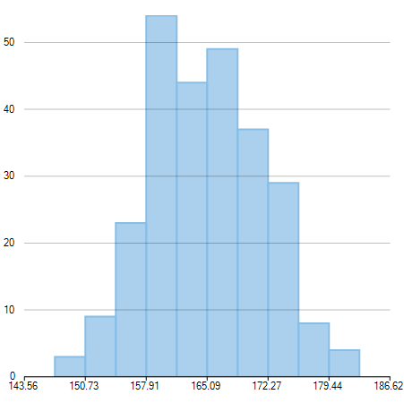
Histogram Chart
Histogram chart plots the frequency distribution of data against the defined class intervals or bins. These bins are created by dividing the raw data values into a series of consecutive and non-overlapping intervals. Based on the number of values falling in a particular bin, frequencies are then plotted as rectangular columns against continuous x-axis.
These charts are commonly used for visualizing distribution of numerical data over a continuous, or a certain period of time.
Step Chart
Step charts use horizontal and vertical lines to present data that show sudden changes along y-axis by discrete amount. These charts help display changes that are sudden and irregular but stay constant till the next change. Step charts enable judging trends in data along with the duration for which the trend remained constant.Consider a use case where you want to visualize and compare weekly sales and units downloaded of a software. As both of these values vary with discrete amounts, you can use step chart to visualize them. As shown in the image below, apart from depicting the change in sales these charts also show the exact time of change and the duration for which sales were constant. Moreover, you can easily identify the magnitude of respective changes by simply looking at the chart.
FlexChart supports Step chart, StepSymbols chart, and StepArea or filled step chart. The following table gives detailed explanation of these chart types.
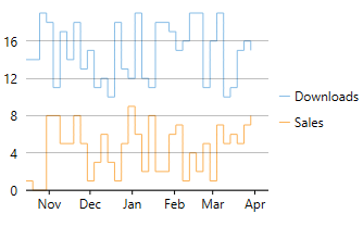
Step Chart |
Step chart is similar to the Line chart, except that Line chart uses shortest distance to connect consecutive data points, while Step chart connects them with horizontal and vertical lines. These horizontal and vertical lines give the chart step-like appearance. While the line charts depict change and its trend, the Step charts also help in judging the magnitude and the intermittent pattern of the change. |
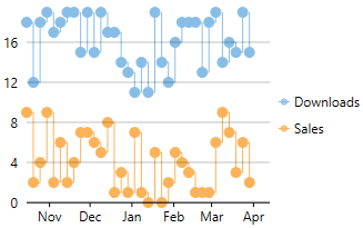
StepSymbols Chart |
StepSymbols chart combines the Step chart and the Scatter chart. FlexChart plots data points by using symbols and connects those data points with horizontal and vertical step lines. Here, the data points are marked using symbols and, therefore, help mark the beginning of an intermittent change. |
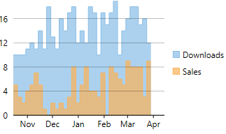
StepArea Chart |
StepArea chart combines the Step chart and the Area chart. It is similar to Area chart with the difference in the manner in which data points are connected. FlexChart plots the data points using horizontal and vertical step lines, and then fills the area between x-axis and the step lines. These are based on Step charts, and are commonly used to compare discrete and intermittent changes between two or more quantities. This gives the chart stacked appearance, where related data points of the multiple series seem stacked above the other. For example, number of units downloaded and sales of a software for a particular time duration can be easily compared as shown in the image. |
スプラインおよびスプラインシンボルグラフ
スプライングラフは折れ線グラフと面グラフの組み合わせです。その曲線は各データポイントを通り、系列は個別に描画することも、積層にして描画することもできます。これは、曲線のあてはめを使用して値の差を表示するデータを表現するのに最も効果的な方法です。スプラインシンボルグラフは、スプライングラフに似ていますが、シンボルを使用してデータポイントを表します。
これらのグラフは、製品寿命など、長期にわたるトレンドやパフォーマンスを示す場合によく使用されます。
|
|
|
スプライングラフ |
|
|
|
スプラインシンボルグラフ |
スプライン面グラフ
スプライン面グラフは、線の下の領域が色で塗りつぶされて表示されるスプライングラフです。スプライン面グラフは、面を表示するという点で面グラフに似ていますが、データポイントの接続に、スプライン面グラフはスプラインを使用し、面グラフは線を使用する点が異なります。
スプライン面グラフ