ヒストグラムは、定義されているクラスの間隔(ビン)に対するデータの度数分布をプロットします。これらのビンは、生データ値を重複のない連続した間隔に分割することで作成されます。特定のビンに入る値の数に基づき、連続的な X 軸に沿った長方形の柱として度数がプロットされます。
The following images show a histogram and a cumulative histogram created using FlexChart.
 |
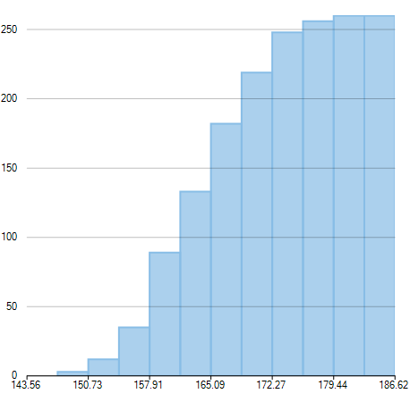 |
| Histogram | Cumulative Histogram |
|---|
Once you provide relevant data, FlexChart automatically calculates the intervals in which your data is grouped. However, if required, you can also specify the width of these intervals by setting the BinWidth property. To create a histogram, you need to add the Histogram series and set the ChartType property to Histogram. You can also create a cumulative histogram by setting the CumulativeMode property to true.
FlexChart generates frequency distribution for the data and plots the same in histogram, upon providing relevant data as shown in the following code snippet.
FlexChart also provides you various options to create following variations of Histogram:
Frequency Polygon
A frequency polygon shows a frequency distribution representing the overall pattern in the data. It is a closed two-dimensional figure of straight line segments -created by joining the mid points of the top of the bars of a histogram.
Use the following steps to create a frequency polygon using histogram chart.
- Set the HistogramAppearance property to FrequencyPolygon. This property accepts value from the HistogramAppearance enumeration.
- Set the style for frequency polygon using the FrequencyPolygonStyle property.
Moreover, you can also create a cumulative frequency polygon by setting the CumulativeMode property to true.
The following images show a frequency polygon and a cumulative frequency polygon created using FlexChart.
 |
 |
| Frequency Polygon | Cumulative Frequency Polygon |
|---|
Use the following code snippet to create a frequency polygon.
|
コードのコピー
|
|
|---|---|
histogramSeries.HistogramAppearance = HistogramAppearance.FrequencyPolygon; histogramSeries.FrequencyPolygonStyle = new ChartStyle() {Stroke = new SolidBrush(Color.Red), StrokeWidth = 2}; // 累積頻度ポリゴンを作成する histogramSeries.CumulativeMode = true; |
|
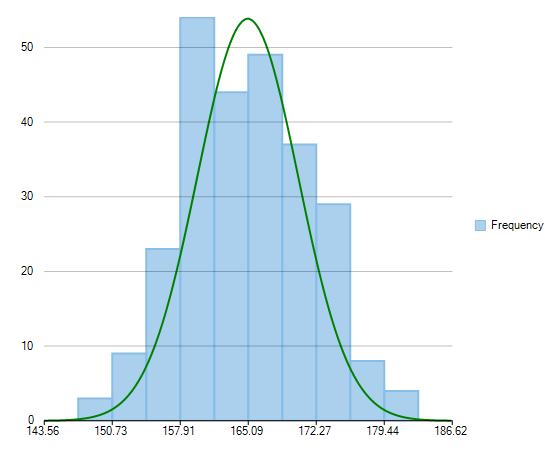
Gaussian Curve
Gaussian curve is a bell shaped curve, also known as normal curve, which represents the probability distribution of a continuous random variable. It represents a unimodal distribution as it only has one peak. Moreover, it shows a symmetric distribution as fifty percent of the data set lies on the left side of the mean and fifty percent of the data lies on the right side of the mean.
Use the following steps to create a Gaussian curve using histogram chart.
- Set the HistogramAppearance property to Histogram. This property accepts value from the HistogramAppearance enumeration.
- Set the NormalCurve.Visible property to true to create a Gaussian curve.
- Set the style for Gaussian curve using the NormalCurve.LineStyle property.
Following image illustrates a Gaussian curve created using FlexChart, which depicts probability distribution of scores obtained by students of a university in half yearly examinations.
Use the following code snippet to create a Gaussian curve.
| Example Title |
コードのコピー
|
|---|---|
histogramSeries.HistogramAppearance = HistogramAppearance.Histogram; histogramSeries.NormalCurve.Visible = true; histogramSeries.NormalCurve.LineStyle = new ChartStyle() Stroke = new SolidBrush(Color.Green), StrokeWidth = 2 }; |
|